Instagram is a Visual Platform
Photographers & people with a good eye for aesthetics have an advantage in this particular social media platform. No matter how interesting you might be, if you have a grid that's all over the place, you might not grab people's attention.
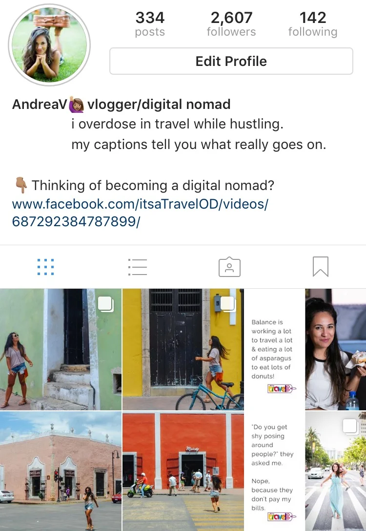
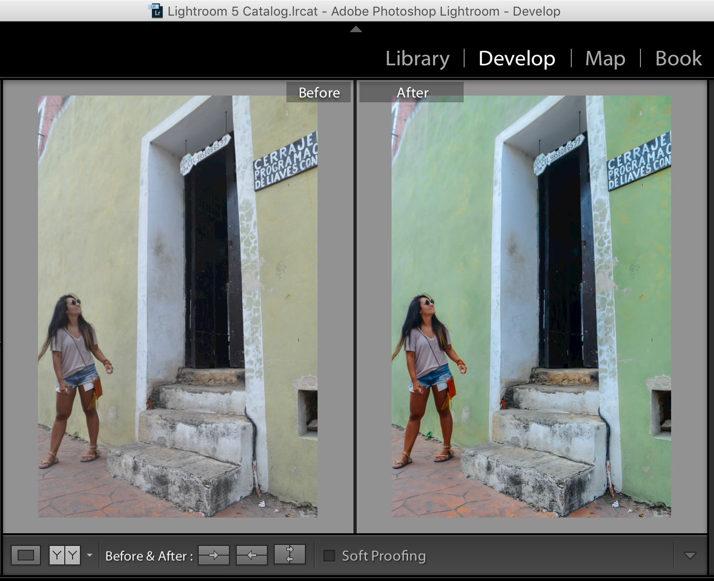
I noticed that my last Valladolid photos (pictured on the right) had pink, red and yellow walls. The last photo posted was shot on a yellow-ish wall. So, what did I do for the sakes of the aesthetic? I changed the wall to green!
Make an Impression!
When people go to your Instagram account for the first time, your last 6-9 posts are your chance to make a good first impression. The decision to click the follow button or not is probably made in seconds.
Doing this felt a bit deceptive deep down. So, I made this post a 'photo album' and included the unedited photo on Instagram, as well.
My end goal with Instagram is to have people read my captions. On there, I share insights of the digital nomad lifestyle and the hustle behind all the 'perfect travel photos.'
Imagine if you showed up to a party looking great, but didn't talk to anyone there.
That's what posting photos on Instagram without captions feels like to me. I can see the beauty, but if I don't get to know you, what you think, what you feel, what you do or what you like... it's hard to connect.
At the end of the day, I want to use Instagram (and all social media platforms!) to socialize, meet people, network, laugh with strangers that might become friends.
Anyway... are you happy with how your Instagram grid looks like?
Keep overdosing in travel!
by Andrea Valeria (@itsaTravelOD)
Screenshot of my Instagram grid.
I edited the image on Lightroom.


